Saturday, July 9, 2011

breathtaking data art


It doesn't matter how many times I look at this image: I still find it stunning. I have a 3-foot by 3-foot version printed on canvas that hangs on my wall.

What exactly is it, you may ask? It's San Francisco, mapped by photo locations from Flickr and Picasa search APIs and then plotted on OpenStreetMap. Those posting photos in a given city for more than a month are considered local (blue); those posting in the given city for less than a month who appear to be residents of another city based on their posting are considered tourists (red). Yellow designates those not fitting into either category (likely but not conclusively tourists). Lines connect places where the same person took two pictures within ten minutes of each other.

It's simultaneous art and information discovery. The expected places are red: Golden Gate, Alcatrez, Fisherman's Wharf. But there are some places I hadn't realized were so frequented by tourists until I studied this infographic: twin peaks, AT&T stadium, Berkeley. Makes sense, just not something I would have known before seeing the data.

This piece is part of a collection (currently made up of 135 cities) called Locals and Tourists by Eric Fischer. Take a look, find your favorite city, and see what you can learn!

Thursday, July 7, 2011

how we use the mobile web

One of the perks of writing this blog is that friends and colleagues send me all sorts of examples of data visualization that they come across in their daily lives. This is helping me to amass quite the collection of good and not-so-good infographics.

A recent forwarded email from a friend had examples that fall into both of these categories. The email highlighted 10 recent infographics on the topic of how people use the mobile web. I've included my favorite and least favorite (aka favorite example of what not to do) below.

Thanks, Danny, for sharing!


Favorite
Why I like it: it's clean and easy to read. I think the use of pics vs. words to label the chart axes is clever (and manages to be straightforward without being obnoxious). It allows for some interesting info discovery, for example, high tablet use while watching television.

I would like a little more information on exactly what data is being depicted, though. Is it the percent who say they ever access the web on the given device in the given location/occasion, or do so with some specific level of frequency?


Least favorite
Why I think it's bad in a nutshell:
  • It's glitzy and includes a lot of noise that distracts and doesn't add informative value: background figures, shadowing, bizarre shapes and fonts. The Christmas color scheme, in addition to being obnoxious, is not color-blind-friendly.
  • The data visuals are hard to read (visual comparisons between the number of little phones or - even better - little phones with little bows on them - are not straightforward for our eyes, which have a hard time attributing quantitative value to 2D space).

Sunday, July 3, 2011

food & data viz

As those who know me are aware, in addition to opining on visual representations of information, I also cook (and blog about cooking at cole's kitch). I've joked in the past that those sharing the intersection of my personal passions - data visualization and cooking - are likely few in number. But every so often, I am reminded that there are some of them out there. The following is a snapshot of some cool things in this space I've come across recently.


Two years of food consumption...visualized
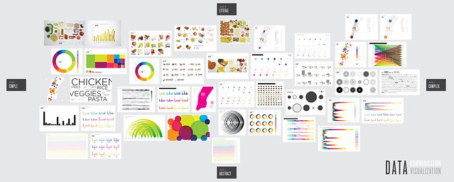
As part of her PhD thesis, Lauren Manning documented everything she ate over the course of a two year period. She turned this dataset into 40 visual representations of her food consumption. Crazy, or cool? I vote supercool. In the matrix below, the various visuals are arranged along an x-axis that ranges from straightforward (left) to complex (right) and a y-axis that ranges from literal (top) to abstract (bottom).


One thing I'm unsure of is the order in which the food groups appear in the various visuals. It's consistent across most of the visuals, which is helpful, but there isn't a clear meaningful order. If there isn't an intrinsic order in categories, how they are ordered should be an explicit decision on the part of the designer, as it has important implications on what stands out and what gets compared within the visual. The easiest comparisons are those next to each other. So if we were to group all of the starches, for example, it would become immediately clear that the majority were consumed in the form of pasta. Or you could order the categories by food consumption (from greatest to least or vice versa), which would better highlight the relative differences between neighboring categories.

One visualization that I didn't see in Lauren's set that I would be tempted to try with this data: spider graphs.


Our dwindling food supply
National Geographic Magazine recently published an interesting visual showing the relative varieties of different fruit and vegetables a century ago vs. today. In the visual, the width represents the number of varieties of the given food. Above ground are the varieties that existed in 1903; below ground is 1983.

The conclusion is a sad one: 93% of the varieties that existed in 1903 have gone extinct.

View original.


A complete guide to kitchen tools
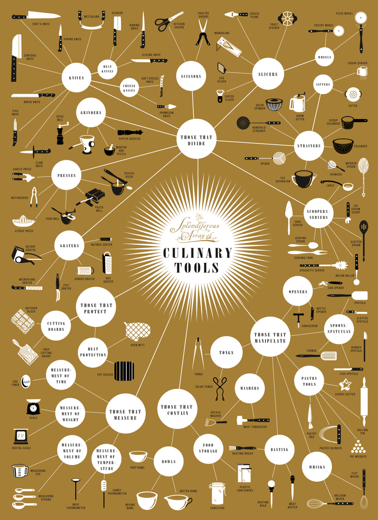
The following poster by Brooklyn-based Pop Chart Lab arranges kitchen apparati into a massive flow chart. The tools are divided into categories according to function (e.g. those that divide, those that protect).

I find the "meat manipulation" category a little frightening (looks like a bad mob-murder-tool-kit). But happy to see it's neighboring category, "tongs", which I've been told are perhaps the most important tool in any kitchen.

View original.


If you happen to come across other interesting food related data visualizations, be sure to send them my way!