Thursday, September 1, 2011

visualize this

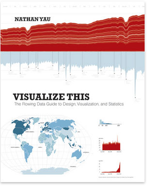
Nathan Yau writes one of my favorite data visualization blogs, FlowingData. His recently published book has been sitting on my shelf untouched for much too long. Earlier this week, I decided to remedy that.

His book is Visualize This. Subtitle: The FlowingData Guide to Design, Visualization, and Statistics. It's written in the first person and is super accessible, full of examples and anecdotes to make the lessons real. The book includes references to a lot of publicly available data and also has links to each dataset used, so the reader can follow along through the steps that are explained.

After starting with an introduction on telling stories with data (obviously near and dear to my heart), the book jumps into the practical question of how. There are step by step instructions for scraping data from websites, using Python to reformat it, and the strengths and weaknesses of various out of the box applications and programming languages for analyzing and visualizing data.

By his own words, Nathan's book is "example-driven and written to give you the skills to take a graphic from start to finish." It accomplishes this goal. The middle chapters each focus on a different kind of visualization problem: visualizing patterns over time, visualizing proportions, visualizing relationships, spotting differences, and visualizing spatial relationships. Yau follows a thorough, hands on approach. For example, in the chapter focused on time series, he goes through what to look for, the best types of graphs to use in different scenarios, how to load the data into and plot in R, and how to fine tune the visual using Illustrator. Relevant statistical methods are incorporated as makes sense, for example, smoothing and estimation.

While there is some very solid foundational material, the majority of the book is focused on the practical question of how to actually analyze and visualize the data. It seemed to me most tailored to the person who is looking to move beyond Excel and the like and get started using R and Illustrator (with some time devoted to interactive graphics as well).

Throughout, Nathan's graphics are beautiful and accessible - great examples of effective data visualization. He follows the rules he sets forth in every one:

  • explain encodings,
  • label axes,
  • keep your geometry in check,
  • include your sources, and
  • consider your audience.

The final chapter focuses on designing with a purpose. He says he always assumes that people are showing up to his graphics blindly and puts the onus on himself as the designer to prepare the audience with the relevant context and insights. "After you learn what your data is about, explain those details in your data graphic. Highlight the interesting parts so your readers know where to look. A plain graph can be cool for you, but without context, the graph is boring for everyone else."

Well said, Mr. Yau!

Monday, August 29, 2011

crushing on your data viz

Oh, what a month. Those who know me understand my posting hiatus...my mind and energy have been elsewhere. But I'm starting to refocus it back on normal life-stuff, for example getting caught up on some data viz reading. 

I was perusing the Tableau Visual Guidebook and came across a snippet I appreciate; it followed the descriptions of all of the different things you can do to format your data viz using Tableau: 

Do you like your viz? After all of this arduous, tedious and difficult tweaking, you better have a little crush on your viz. If not, it may be time to break up and start over.

I like this idea of crushing on one's data viz. I find myself saying this again and again, but plotting data in a graphing program should be the first step in data visualization, not the last. After doing that, here are the typical steps I find myself going through and questions I routinely ask to get to the final ready-for-consumption visual:

 
1. Assess the chart type
  • Is it a pie chart? If yes, read this post. If no, move to the next bullet.
  • Is there a more straightforward way to present the data? I often find myself doing an "is-this-better?" comparison, where I'll have my working version of the graph, then try graphing it differently and do a side by side comparison to see which is the easiest to interpret. Going through a few rounds of this can help ensure you've got a chart that someone else will be able to read. 
  • Don't leave the details in question: make your chart legible by giving it a title and labeling all axes.

    2. Highlight the important stuff
    • Use preattentive attributes (e.g. color, size) to create a visual hierarchy of information and draw your audience's eye to where they should focus their attention. Use color sparingly and strategically.
    • Here's a fun test: look away from your visual and then back to it. Where is your eye drawn? This is likely where your audience's eye will be drawn as well, so if it isn't in the right place, revisit how you're using your preattentive attributes (especially color).

    3. Get rid of the clutter
    • Cut anything superfluous: every bit of reduction in noise makes the signal of your data stand out more. For example, assess whether you need gridlines (here is a post on this).
    • Push things like footnotes, data sources, as of dates to the background by making them grey, small, and positioned in lower attention areas, like the bottom of the page; this way they are there for reference but don't detract from the key parts of your visual.

      4. Assess the overall visual
      • Does the data viz facilitate the story I want to tell, or the data discovery I want my audience to make? Here is an example where this is done well.
      • A good test of this is to hand your visual to a friend or colleague who is unfamiliar with it. Give them 10-20 seconds (and no context) and have them tell you what they see. If it isn't what you're hoping, it's time to revisit your design.


      The folks at Tableau are spot on. This takes time and patience. After doing all of this work (irrespective of the specific graphing application), you should think your data visualization is just about the best thing on the planet. Or be so sick of it you never want to see it again. :-)

      Here are some links to previous posts with before-and-afters that walk through different parts of the above process. I totally found myself crushing on each of these after spending so much time with each:

      I think the crush is good evidence that sufficient time has been spent on a very important step of the analytical process: communicating your findings visually to others.

      Monday, August 1, 2011

      gridlines are gratuitous

      How often do you use the gridlines on a chart to read the data?

      Not very often.

      And yet there they are, prominently, when you plot your data with most graphing applications. I've said this before, and I will say it again: plotting data in a graphing application like Excel should be your first step in the data visualization process, not your last!

      Gridlines typically act as nothing more than clutter, unnecessarily competing for attention with your data. Don't let them. In the event that gridlines are important for being able to read the data you are presenting, push them to the background by making them a light shade of grey. In most cases, I'd argue that your audience isn't going to make use of the gridlines at all. If this is the case, remove them completely.

      Let's see what this looks like in practice through the chart progression below.

      The first chart is what I get when I plot my data in Excel (using my mac).

      In the second chart, I stripped out a bit of clutter by eliminating the chart border and reducing the labels and tick marks on the x-axis. I also pushed the axes and gridlines to the background by making them grey and tied the title of the graph visually to the trend line by making the title the same shade of blue. I justified the graph title and y-axis title at upper leftmost because in Western cultures most people read from left to right, top to bottom; this makes it so the audience encounters how to read the graph before they get to the actual data. This is looking better, right? The data stands out more than in the initial version, where there was no visual hierarchy to help direct our attention.

      In the final graph, I removed the gridlines altogether. Note that the data stands out the most in this version, because it isn't competing visually with the gridlines for your attention.

      The lesson is this: if your audience isn't going to use gridlines to read the data, get rid of them! At the very least, push them to the background. At best, they aren't particularly helpful. At worst, they distract from your data.

      Don't let your visuals fall victim to this unnecessary graphing application clutter!
      Data source: http://seer.cancer.gov/