Showing posts with label Tips. Show all posts

Wednesday, May 13, 2015

tell your audience what you want them to know

It sounds simple. It sounds obvious. But how often do people give a presentation or send out a report or email without ever making it clear what they want you to know? 

Have you ever looked at a graph and thought, I'm not sure what I'm meant to get out of this? Or sat through a presentation or meeting only to realize once it's over that you're not really sure what you just witnessed?

I listened to a presentation last week where the person speaking put up a busy-looking, data-heavy slide. It wasn't a good slide, but the speaker was clearly comfortable on stage and knowledgable about his topic, so I was motivated to understand what he was trying to communicate. Then he said a few magic words: "what this is meant to show is..." followed by a clearly articulated statement. It is amazing how those simple words can make the intimidating accessible.

The effect these words had on me was to generate more patience on my part (and even a little curiosity) to understand what the slide was showing. The speaker knew what he wanted the audience to get out of it and walked us through the visual in a way that made sense. It still wasn't a fantastic visual - there are changes that could have made it more effective - but his words overcame this shortcoming.

Tell your audience what you want them to know.

It's simple advice, but the impact can be profound!

Tuesday, April 28, 2015

the power of categorization

There are still a few spots left in upcoming Dallas (5/5) and San Francisco (5/11) public workshops: details and registration can be found here.

I am writing this post on the heels of a lovely albeit short European trip. It included a few days in London, where I had the opportunity to conduct a day-long workshop and also present at Tucana Global's 2015 People Analytics conference. In our spare time, my husband and I ventured out to one of our favorite restaurants: Ottolenghi. As I was perusing the wine list, I was reminded of the importance of categorization (yes, apparently my data-brain is on even at dinnertime). Let's take a quick look at how categories help us make sense of things: both in life and in data visualization.

Here's a pic of the drink menu that inspired this post:


In the case of the drink list, categories ease our processing of the information. They appear on the left: aperitif, sparkling, rose, white, orange (!!), and red. Can you imagine how increasingly difficult the task of picking something to drink would be without this categorization to help us make sense of the list and understand where to focus our attention? There would also be a greater potential for misinterpretation - for example, without the categorization, I might have (incorrectly) assumed Dabouki to be a red wine. I certainly would have (again, incorrectly) believed Bianco Amphora to be a white wine. The processing of the information was made easier (and with less room for error) because I had a well-labeled construct to use as I interpreted the information.

Categories can be similarly useful when it comes to helping your audience interpret your data visualization. Let's look at one of the examples I discussed briefly at the People Analytics conference.

In the example below, data is plotted in a scatterplot across two dimensions. Imagine your organization collects information about its managers via an upward feedback survey, ultimately quantifying a manager's capabilities (as assessed by his or her team) with a single number. Your company also has a performance management process, through which everyone receives a performance rating. It might be useful to look at the upward measure (how employees feel about their boss) and the downward-looking measure (how the manager performs, as determined by their manager) together. This is shown below.

The vertical y-axis shows the manager rating. The horizontal x-axis shows performance rating. Each manager in your company is a point on the scatterplot.

We can add additional labels on each axis to help with the interpretation of the information. With this setup, the audience need not know that a higher % favorable on the Upward Feedback Survey indicates a better manager (in the same way that I didn't need to know that Dabouki is a white wine because of the categories on the drink menu).

We can take this a step further and add categories onto the x-y plane directly:


I'll admit that this final version does look a bit intimidating at first. For this reason, there can be value in starting with less and adding more, explaining what you're doing to your audience at each step so they can follow along with you, making the final visual feel less intimidating than it might otherwise. In my presentation, I started with a blank graph with only the axis labels and first described what I would plot (before showing any actual data; this can be a nice way to create anticipation among your audience as well). In the next view, I added the points to the previously blank graph. Then I emphasized the average. Following that, I drew the quadrants by adding vertical and horizontal lines based on the average. Then I drew attention to the points at the bottom left by making them red and adding the label Low/Low. Finally, I ended with the version shown above with all quadrants labeled and light shading at upper left and lower right.

In this final view, note also how the added labels on the graph make the data easier to talk about. With the quadrant titles, I can focus conversation on the cases where managers are scoring low from both the upward or downward perspectives (Low Perf/Low Mgr Score in red at the bottom left). Or there might be some interesting discussion in the cases where the signals don't align - Low Perf/High Mgr Score at the top left or the opposite on the bottom right.

Meta-lesson: categories (and more generally, descriptive and pithy labels) can help your audience interpret the data you show.

My other European destination this trip was Paris, where my husband and I enjoyed more amazing food, saw many sights, and perused many more drink menus. The overall trip was great, only too short. I hope to travel to Europe again this summer for a longer stay. If you are reading this and interested in discussing a potential workshop for your European team or organization, reach out to me at cole.nussbaumer@gmail.com.

I'll close with a couple pics of Parisian adventures with my favorite travel partner.

Eiffel Tower in the distance!
Musee D'Orsay

Thursday, February 26, 2015

annotate with text

In keeping with my prior post, I'm sharing another "most-photographed slide" from my recent workshops.


My voiceover typically sounds something like this:

When it comes to storytelling with data, one very important component of stories is words. There are some words that absolutely have to be there: every graph needs a title and every axis needs a title. This is true no matter how clear you think it is from context. The only exception that comes to mind is if your x-axis is January, February, March, etc., you probably don't need to title it "months of the year." You probably should make it clear what year it is. Any other axis needs a title. Label directly so your audience doesn't question what they are looking at.

Don't assume that two different people looking at the same data visualization will walk away with the same conclusion. Which means, if there is a conclusion you want your audience to reach, you should state it in words. Use what we know about preattentive attributes to make those words stand out: make them big, leverage color and/or bold, and put them in high priority places on the page like the top.

Speaking of which, that title bar - stories have words: annotate with text - is precious real estate. It is the first thing your audience encounters when they see your screen or your page, so make it count. Use this space for active titles, not descriptive titles. If there is a key takeaway for your audience, put it there so they don't miss it. It will also help set up the content that is to follow on the rest of the page.

When you are communicating with data, there are some words that usually need to be there: data source, as of date, and perhaps notes on assumptions or your methodology. These are necessary words but they don't need to cry out for attention. Use what we know about preattentive attributes to emphasize the important parts of your visual and also to de-emphasize less critical pieces. Footnotes can be small, the text can be grey, and they can be in lower priority places on the page like the bottom.

Use words to title, label, and explain; they help make your data visualizations accessible!

To see this and other storytelling with data lessons firsthand, attend one of my upcoming public workshops.

Monday, February 23, 2015

consulting for context

Upcoming workshops: Details have been set for my Chicago public workshop - it will be on 3/23 and you can register here. I'm offering a full day workshop in London as a pre-conference session ahead of Tucana Global's People Analytics conference in April (it can be registered for separately from the conference and content will be made relevant to non-HR as well), details here. I'm also in the planning stages of a public workshop in Dallas in early May - to be notified when it is scheduled or suggest/volunteer a venue, click here.

Speaking of workshops, I've conducted a lot of them over the past three weeks. It takes nearly all of my fingers to count them. I've packed so many into a small time period that I've started to observe some interesting patterns across them. I'll tell you about one such pattern today.

I tend to begin each workshop by asking attendees to do something that I think may make some people feel uncomfortable: take whatever electronic devices are within their reach and place them slightly out of reach. (There is little that is more distracting in a shared learning environment than someone typing on their laptop or texting on their phone!) 

Still, somehow, people end up with phones in their hands.

To my amusement, however, for the most part they don't appear to be using their phones to check their email or update their Facebook status, but rather to snap a quick pic of the slide I'm discussing. This is one use of an electronic device in my workshops that I might be willing to condone! The pattern I referred to earlier is that it seems to be the same handful of slides that prompt said picture-taking. I believe this is an indication of the usefulness of the content, so thought I'd share some of that content with you here.

One popular slide is about consulting for context and lists the following thought-starters:
  • What background information is relevant/essential?
  • Who is your audience? What do you know about them?
  • What biases does your audience have that might make them resistant to your message?
  • What data is available that would help strengthen your case? Is your audience familiar with this data, or is it new?
  • What would a successful outcome look like?
  • If you only had one minute or a single sentence to tell your audience what they need to know, what would you say?
My voice-over of this slide usually sounds something like the following. Often, when you are putting together a communication, it is at the request of someone else: a client, a stakeholder, or a manager. Sometimes, the person requesting the work has things in their head that are important to understand that they may not think to say out loud. The above are some questions you can use when that's the case, to try to tease the full context out of the person requesting to make sure you have a robust understanding of the need to communicate before you start building the actual communication. Being clear on the context up front can drastically reduce iterations down the road.

I find the last two questions in particular can be really useful for getting at the main message you want to communicate. I often use these when I'm working with clients to get clarity on what they want to say. What would a successful outcome look like? Or, if you had a really finite amount of time or number of words to say what you need to say: what would that sound like?

I use this to set up the concepts that are typically covered next (that I've blogged about here previously): the 3-minute story and Big Idea.

Interested in other parts of my workshops that are prompting people to photograph what they see? Stay tuned here and I'll highlight some others in upcoming posts!

Tuesday, August 26, 2014

design with audience in mind

Recently, my husband shared a USA Today graphic with me that summarizes diversity stats across a number of Bay Area tech companies. Surely, this would be a good blog topic, he told me. He knows me well. Here is a screenshot of the visual:

Online version can be found here.

First, let me mention how cool I think it is that companies like Google have started sharing their diversity stats. I expect that with this transparency, we'll see movement towards more diverse workforces over time.

Next, let me discuss what an annoying user experience it is to try to look at the diversity data with USA Today's visual. It shows the breakdown for the given company (Apple, in the above screenshot) by gender on the left and ethnicity on the right. The various tech companies each have their own tab; you can toggle between companies using the numbered tabs along the left (not sure what the numbers on the tabs mean...if anything).

What is the first thing you want to do with this data?

For me, the stats for a given company, on their own, are not so interesting. It's by comparing them to the other companies that we help build context for what is good (or if not good, then at least better), what is worse, and so on. In other words, the single thing I want to do most is compare the stats across companies. The way this visual is organized makes this a lot harder than necessary. If I want to compare the proportion who are women at Apple (for example) to other companies, first I look to the Apple tab and commit 30% to memory, then I click through the other tabs one by one to try to put that 30% into context. This is annoying, but possible.

It gets more annoying and difficult if you try to do it by ethnicity. Try comparing the proportion Hispanics make up of the various workforces, for example. It's further complicated by the fact that the slices on the pie move and the order in which the companies are listed changes as you toggle between companies.

This is not an ideal user experience. My guess is that there was some desire to make the visual "interactive," which it sort of feigns via the tabs of various companies along the left. But really all this does is allow you to see the various static graphs, one at a time. Why not replace with a single static visual that makes the task your audience is going to want to do easy?

In other words, let's design the visual with our audience - and how they are going to want to interact with the data - in mind. If the goal is to compare across companies, I might do something like the following:


(Note that the title and takeaway at the top were preserved from USA Today's visual; I'm not sure I would have been quite as negative.)

The above version allows me to see things that were very difficult to get to with the original. eBay is doing the best from a gender diversity standpoint, but worse when it comes to racial diversity, where Yahoo is doing better than the others, etc.

Bottom line: design with your audience in mind!

Click here to download the Excel file with the above visual.

Monday, July 14, 2014

lead with story

July is storytelling month over at the Tableau Public Blog; the following is a guest post I authored.

When asked to write a guest blog post for this month's focus on storytelling, I spent some time reflecting: if I had just a single lesson to share, what's the #1 piece of advice I'd give in this space? I'd boil it down to three simple words: lead with story.

It may sound counterintuitive, but success in data visualization does not start or end with data visualization. To resonate with your audience, you need to do more than simply show data. Attention and time should be paid to the context for the need to communicate: what does your audience need to know? What do they need to do? How can you make the data you want to share meaningful and memorable? Part of the answer is story. Stories resonate and stick with us in ways that data alone cannot. Purposeful story can bridge the gap between showing data and imparting information.

Now, if you're an analyst by training (like me), "leading with story" might strike you as a little off-putting. This can be an uncomfortable space for many. Often, this seems to be driven by the belief that the audience knows better and therefore should choose whether and how to act upon the information presented. In other words, that they should be the ones creating the story. I would argue this is rarely (if ever) the case: if you are the one analyzing and communicating the data, you likely know it best, you are a subject matter expert. This puts you in a unique position to interpret the data and lead people to understanding and action. So, while it may feel more comfortable to lead with the data, I recommend you fight this urge when it comes to explanatory analysis and lead with story.

To ensure you story comes across clearly, there are two lessons to keep in mind: 1) don't make your audience wait for it, and 2) don't make your audience work for it. Let's discuss each in a little more detail and then look at an example of these lessons in action.


Don't make your audience wait for story
Don't bury your story: lead with it! Too often, I see situations where the communicator of the information wants to take the audience through the same chronological path they took to reach their conclusion. In most cases, this is unnecessary. Rather, lead with the "so what" and then back up into the path you took to get there only if absolutely necessary. This way, you don't leave your audience wondering when you're going to get to the point and run the risk of losing their attention before you do.

When it comes to crafting the narrative arc, I recommend storyboarding. Storyboarding is perhaps the single most important thing you can do up front to ensure the communication you're crafting is on point: it establishes a structure for your communication. Write each of the main points you want to make on a post-it note. Then you can play with different arrangements to get the right flow that makes sense given your audience and what you want to communicate. Once you get the flow how you want it using this low-tech method, you can leverage Tableau's Story Points feature to create this same narrative arc with your data visualizations. For more on storyboarding, check out this blog post.


Don't make your audience work for story
Spend time making the story you're telling impossible to miss in your data visualization by leveraging visual cues to help direct your audience where to look. Without these visual cues, our audience has to do work to figure out where they are meant to pay attention. When we ask our audience to do work, we run the risk of them deciding they don't want to and moving on to something else, at which point we've lost our opportunity to communicate. Preattentive attributes like size, color, and placement on page/screen can be used strategically to signal to your audience where to look in the visual for evidence of the story you are telling. For more on preattentive attributes, check out this blog post.


Lessons in action
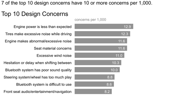
Let's look at a simple example applying these lessons (if you're a regular reader, you may recognize this example, as I've used it before). Imagine you work for a car manufacturer. You're interested in sharing insight around the top design concerns for a particular make and model. Your initial visual might look something like the following:


While the preceding view may work as part of your exploratory analysis (where you're looking at the data to understand what might be interesting or noteworthy), it can be improved when it comes to explanatory analysis (where you want to communicate those interesting or noteworthy observations to someone else) by applying the lessons we've discussed.

First, let's think about what story we want to tell and make that clear with words:


In the above, we've made clear the point we want to make via the statement above the graph. However, our audience has to do some work to see the evidence of those words in the data. Let's reduce that work by employing some visual cues to help direct their attention:


In the above iteration, it's clear where our audience is meant to look through strategic use of color. We can even take this a step further, continuing the narration and use of color to tell a story with the data we are showing:


In this example, annotation and strategic use of color are combined to turn a simple graph into something more. Lead with story: don't make your audience wait for it or work for it.

Here is the above sequence published on Tableau Public.

Leverage these lessons and Tableau's Story Points feature to turn your data visualizations into compelling stories!

Wednesday, June 18, 2014

leveraging animation: what you present vs. what you circulate

A common challenge in storytelling with data is the following conundrum. When presenting content live, you want to be able to walk your audience through the story, focusing on just the relevant part of the visual. However, the version that gets circulated to your audience - as pre-read or takeaway, or for those who weren't able to attend the meeting - needs to be able to stand on its own without you, the presenter, there to walk the audience through it. Too often, we use the exact same content and visuals for both purposes. This typically renders the content too detailed for the live presentation (particularly if it's being projected on the big screen) and sometimes not detailed enough for the circulated content.

I often tackle this topic in my workshops and have written about it here a couple of times before (look for any posts including the word "slideument," for example this one). In the following post, we'll look at a strategy for leveraging animation coupled with an annotated line graph to meet both of these needs.

Let's assume that you work for a company that makes online social games. You are interested in telling the story around how active users for a given game, let's call it Moonville, have grown over time.

You could use the following visual to talk about growth since the launch of the game in late 2012.


But in doing so, you run the risk of your audience focusing elsewhere in the data while you're talking. Perhaps you want to tell the story chronologically, but your audience may jump immediately to the sharp increase in 2014 and be thinking about what drove that. When they do so, they aren't paying attention to what you're saying.

Alternatively, you can leverage animation to walk your audience through your visual as you tell the corresponding points of the story. For example, I may start with a blank graph (which forces the audience to look at the axis details with you, vs. jump to the data; it can also help build anticipation that will help you to retain your audience's attention). Then I can subsequently show or highlight only the data that is relevant to the specific point I am making, forcing my audience's attention to be exactly where I want it to be as I am talking.

I might say - and show - the following progression:

Today, I'm going to talk you through a success story: the increase in Moonville users over time. First, let me set up what we're looking at. On the vertical y-axis of this graph, we're going to plot active users. This is defined as the number of unique users in the past 30 days. We'll look at how this has changed over time, from the launch in late 2012 to current, shown along the horizontal x-axis.


We launched Moonville in September 2012. By the end of that first month, we had just over 5,000 active users, denoted by the big blue dot at the bottom left of the graph.


Early feedback on the game was mixed. In spite of this - and our early practically complete lack of marketing - the number of active users nearly doubled in the first four months, to almost 11,000 active users by the end of December.


In early 2013, the number of active users increased along a steeper trajectory. This was primarily the result of the friends and family promotions we ran during this time to increase awareness of the game.


Growth was pretty flat over the rest of 2014 as we halted all marketing efforts and focused on quality improvements to the game.


Uptake this year, on the other hand, has been incredible, surpassing our expectations. The revamped and improved game has gone viral. The partnerships we've forged with social media channels have proven successful for continuing to increase our active user base.


At recent growth rates, we anticipate we'll surpass 100,000 active users in June! 

For the more detailed version that you circulate as a follow up or for those who missed your (stellar) presentation, you can leverage a version that annotates the salient points of the story on the line graph directly, as shown below.


This is one strategy for creating a visual (or in this case, set of visuals) that meets both the needs of your live presentation and the circulated version. Note that with this approach, it's imperative that you know your story well to be able to narrate without relying on your visuals (something you should always aim for regardless).

If you're leveraging presentation software, you can set up all of the above on a single slide and leverage animation for the live presentation (with the final annotated line graph positioned on top so it's all that shows on the printed version of the slide). If you do this, you can use the exact same deck for the presentation and the communication that you circulate. Alternatively, you can put each graph on a separate slide and flip through them; in this case, you'd only want to circulate the final annotated version.

If you're interested, the Excel file with the above visuals can be downloaded here.

Wednesday, June 4, 2014

alternatives to pies

My disdain for pie charts is well documented. While opinions on their usefulness run the gamut, I am certainly not alone in my contempt. In my workshops, I sometimes get the question, "In what situation would you recommend a pie chart?" For me, the answer is never.* There are a number of alternatives, each with their own benefits. It's these alternatives that I'll focus on in this post.

*Full disclosure: There was once a situation at Google where we wanted to share some diversity stats on gender breakdown but didn't want to show the specific values. In this case, the fact that it's tough for people to attribute accurate value to 2-dimensional space worked to our advantage and we leveraged a pie chart absent of any value labels. Though, now that Google is sharing their diversity stats publicly (I'll resist the urge to comment on the ill-chosen donut graphs they are using to do so) it seems even this has become a moot need.

The following is an example that I often use in my workshops (based on a real example, but modified a bit to preserve confidentiality). By way of context: imagine you just completed a pilot summer learning program on science aimed at improving perceptions of the field among 2nd and 3rd grade elementary children. You conducted a survey going into the program and at the end of the program and have visualized the resulting data in the following set of graphs.


I believe the above data demonstrates that, on the basis of improved sentiment towards science, the pilot program was a great success. Going into the program, the biggest segment of students (40%, the green slice in the left pie) felt just "OK" about science - perhaps they hadn't made up their minds one way or the other. Whereas after the program (pie on the right), that 40% in green shrinks down to 14%. Bored (blue) and Not great (red) went up a percentage point each, but the majority of the change was in a positive direction: after the program, nearly 70% of kids (purple + teal segments) expressed some level of interest towards science.

The above visual does this story a great disservice. Yes, you can get there, but you have to first overcome the annoyance of trying to compare slices across two pies. There's no need for this annoyance: choose a different type of visual!

Let's take a look at four alternatives using the above data.

Alternative #1: Show the Number(s) Directly
If the improvement in positive sentiment is the big thing we want to communicate, we can consider making that the only thing we communicate:
Too often, we think we have to include all of the data and overlook the simplicity and power of communicating with just one or two numbers directly, as in the above. That said, if you feel you need to show more, look to one of the following alternatives.

Alternative #2: Simple Bar Graph
When you want to compare two things, you typically want to put those two things as close together as possible and align them along a common baseline to make this comparison easy. The simple bar graph does this. This is the "after" version that I typically use in my workshops (which is why you see more narrative integrated into the following visual than the other alternatives).

Alternative #3: 100% Stacked Horizontal Bar Graph
When the part-to-whole concept is a must-have (something you don't get with either of the above solutions), the stacked 100% horizontal bar graph achieves this. Note that you get a consistent baseline to use for comparison both at the left and at the right of the graph, which can be useful in cases such as this, allowing the audience to easily compare both the negative segments at the left and the positive segments at the right across the two bars. Because of this, I find this to be a useful way to visualize survey data in general.

In the above version I chose to retain the x-axis labels rather than put data labels on the bars directly. I tend to do it this way when leveraging 100% stacked bars so that you can use the scale at the top to read either from left to right (which in this case allows us to attribute numbers to the change from Before to After on the negative end of the scale) or from right to left (to do the same for the positive end of the scale). In the simple bar graph shown previously, I chose to omit the axis and label the bars directly. This illustrates how different views of your data may lead you to different design choices. Always think about how you want your audience to use the graph and make your design choices accordingly - different choices will make sense in different situations.

Alternative #4: Slopegraph
The final alternative we'll consider today is a slopegraph (I've blogged about slopegraphs previously here, here, and here). As was the case with the simple bar chart, you don't get a clear sense of there being a whole and thus pieces-of-a-whole in this view (in the way that you do with the initial pie, or with the 100% horizontal stacked bar). Also, if it is important to have your categories ordered in a certain way, a slopegraph won't always be ideal since the various categories are placed according to the respective data values (in the following, on the right hand side, you do get the positive end of the scale at the top but note that Bored and Not great at the bottom are switched relative to how they'd appear in an ordinal scale because of the values that correspond with this points - if you need to dictate the category order, use the simple bar graph or the 100% stacked bar graph where you can control this).

One thing you do get with the slopegraph is the visual percent change from Before to After for each category via the slope of the respective line. It's easy to see quickly that the category that increased the most was Excited (and the category that decreased markedly was OK). The slopegraph also provides clear visual ordering of categories from greatest to least (via their respective points in space from top to bottom on the left and on the right sides of the graph).

Any of these alternatives might be the best choice given the specific situation, how you want your audience to interact with the information, and what point(s) of emphasis you want to make. The meta-lesson here is that you have a number of of alternatives to pies that can be more effective for getting your point across.

I should note that I had a couple specific sources of inspiration for this post. I recently completed some long overdue reading that included Jon Schwabish's An Economist's Guide to Visualizing Data. In it, Jon discusses a number of data viz best practices through examples of common mistakes and some nice makeovers, including a section focused on alternatives to pies. I highly recommend checking out this paper. Andy Kriebel recently posted a nice makeover of a particularly annoying "data visualization" that tried to combine pie graphs with faces (you have to see it to believe it). There are a few things that are worse than a pie graph: a 3D exploding pie graph, having to compare segments across two pie graphs, and - a recent (and unexpected) addition to the list - the face-pie.

The Excel workbook with the above makeovers can be downloaded here.

Are there other alternatives to pies that should be added to this list? Which one do you favor in this situation? Leave a comment with your thoughts!

Thursday, May 22, 2014

the story you want to tell...and the one your data shows

I was working on a makeover for a recent workshop when it became apparent that the story being told wasn't quite right, or at least wasn't exactly the story I would tell after looking at the data in a couple of different ways. In the following post, I'll walk you through an anonymized version of the makeovers and my corresponding thought process.

The original visual looked something like the following. It was accompanied by the headline, "Price has declined for all products on the market since the launch of Product C in 2010."


Based on the headline, what we're most interested in looking at here is the trend of cost over time for each product. The variance in colors across the bars distract from this and make the exercise more difficult than need be. Bear with me here, as we're going to go through probably more iterations of looking at this data than you might typically, but I think the progression is interesting.

For a first look, let's remove the visual obstacle of the variance in color and see what the resulting graph looks like (at the same time taking other steps to make sure things are appropriately labeled and de-clutter by removing unnecessary gridlines, tick marks, etc.):


Going back to the original headline, we're primarily interested in what has happened since Product C was launched in 2010, so let's emphasize the relevant pieces, forcing our attention there, and see what that reveals:


Upon studying this for a moment, we see clear declines in the average retail price for Product A and Product B in the time period of interest, but this doesn't appear to hold true for the products that were launched later. Plus, you've probably been thinking as you've scrolled through these bar chart iterations that we are looking at time, so perhaps a line graph would make more sense. Let's see what that looks like in the same layout as above:


If it wasn't already apparent, it probably now is with the above that it likely makes sense to graph all of the lines against the same x-axis so that we can more easily compare them to each other. This also reduces the clutter and redundancy of all of those year labels. The resulting graph might look like this:


With this view, we can much more easily see and comment on what's happening over time. Again, going back to that initial headline, I might modify it to say something like, "After the launch of Product C in 2010, the average retail price of existing products declined."


But this view also allows us to see something perhaps more interesting and noteworthy: "With the launch of a new product in this space, it is typical to see an initial average retail price increase, followed by a decline."


And perhaps we'd also want to note, "As of 2014, retail prices have converged across products, with an average retail price of $223, ranging from a low of $180 (Product C) to a high of $260 (Product A)."


Note how, with each different view of the data, you were able to more or less clearly see certain things. You can use the strategy above to highlight and tell different pieces of a nuanced story. Just make sure that the story you are telling is the same one that your data shows!

If you're interested, you can download the Excel file with the above visuals here.

Thursday, May 15, 2014

the visual displays I use most

As part of a project I'm currently working on, I recently went through all the visuals I've created in the past year - for workshops, this blog, and consulting work - and categorized them. Out of the 200+ visuals that I created, there were only a dozen different types of visuals that I used (and just 7 that, together, account for more than 90% of the total visuals I created).

I thought it might be useful to share the stats with you, along with some related blog posts (some of the posts linked below focus directly on the given type of visual display, while others simply show an example of their use).

the visual displays I use most
with % of total displays created in the past year
  1. Horizontal bar graph - 27%
  2. Line graph - 16%
  3. Horizontal stacked bar graph - 14%
  4. Vertical bar graph - 10%
  5. Simple text - 8%
  6. Vertical stacked bar graph* - 8%
  7. Slopegraph - 8%
  8. Heatmap* - 3%
  9. Area graph - 2%
  10. Waterfall chart - 2%
  11. Scatterplot* - 1%
  12. Table - 1%
*I seem to be lacking posts with examples of these types of visuals: 
I'll add over time and link here once the posts are live.

This is certainly not an exhaustive list of types of visual displays of information. But in my experience, just a handful of different types of visuals will meet the majority of your everyday storytelling with data needs.

Wednesday, April 23, 2014

focusing with color

In my previous post, I discussed the distinction between exploratory and explanatory analysis and showed how you can sometimes leverage the same visual when moving from the former stage to the latter, with some minor tweaks. Today, I'd like to consider another example of this and also illustrate how you can use iterations of the same visual to focus your audience with color.

We'll continue with the imagined scenario where you work for a car manufacturer. Today, you're interested in understanding and sharing insight around top design concerns for a particular make and model. Your initial visual might look something like the following:


The above visual could be one of those you create during the exploratory phase: when you're looking at the data to understand what might be interesting or noteworthy to communicate to someone else. The above shows us that there are 10 design concerns that have 8+ concerns greater than 1,000 (the rest of the tail has been chopped off, which would probably be worth a footnote with a little detail on how long the tail is, perhaps how many design concerns there are in total, etc. if you're using this to communicate to others).

You can leverage the same visual, together with thoughtful use of color and text to further focus the story:


Continuing to peel back the onion, we can go a level further than this, again using the same visual with modified focus and text to lead our audience from the macro to the micro parts of the story:


Repeated iterations of the same visual, with different pieces emphasized to tell different stories or different aspects of the same story (as above) can be particularly useful in live presentations, because you can orient your audience with your data and visual once and then continue to leverage it in the manner illustrated above.

If you're interested, you can download the Excel file with the above visuals here.

Monday, April 14, 2014

exploratory vs explanatory analysis

I often draw a distinction between exploratory and explanatory data analysis. Exploratory analysis is what you do to get familiar with the data. You may start out with a hypothesis or question, or you may just really be delving into the data to determine what might be interesting about it. Exploratory analysis is the process of turning over 100 rocks to find perhaps 1 or 2 precious gemstones. Explanatory analysis is what happens when you have something specific you want to show an audience - probably about those 1 or 2 precious gemstones. In my blogging and writing, I tend to focus mostly on this latter piece, explanatory analysis, when you've already gone through the exploratory analysis and from this have determined something specific you want to communicate to a given audience: in other words, when you want to tell a story with data.

Keeping this distinction in mind, I thought it might be interesting to look at a recent makeover and show how the visual you could use for the exploratory and explanatory steps of the analytical process might differ.

For this (generalized & simplified*) example, imagine that you work for a car manufacturer. You're looking at customer feedback, specifically to better understand how failed or less-than-ideal performance across various dimensions for a given make and model impacts customer satisfaction. The primary output variable you're looking at in this case is an overall question in your customer satisfaction survey, where customers are asked to express their overall satisfaction with their car along a 5-point Likert scale (Very Dissatisfied, Dissatisfied, Neutral, Satisfied, Very Satisfied). Let's assume you're most interested in anyone responding with anything other than Very Satisfied, and want to understand how this varies by customers who have reported specific issue(s) with their car, by the type of issue.

*Please keep in mind that I'm making up the specific scenario here; the makeover is a generalized example from a past workshop where I don't have all of the details and also don't have other data that would possibly be of benefit in the exploratory and explanatory phases. For example, there are likely other things that drive the overall satisfaction with the car, which we're ignoring here. Also, anytime you show percents like this, I'd recommend also showing the N count - in this case, the number of people reporting the given issue - which will be helpful for the interpretation of the data.

Your initial visual might look something like the following:


In the above, I've grouped all of the "less than very satisfied" responses (in orange), with the data arranged in descending order of this metric. With this visual, you can scan through the various issues and see the relevant "less than very satisfied" metric. This might be useful for part of your exploratory analysis.

Once you've identified something or some things to focus on, in some cases it will make sense to create a different visual for the purpose of focusing on that thing or those things. Alternatively, the same visual and be modified for explanatory purposes by drawing attention to the points of interest, while preserving the other data for context:


We can use the same visual and approach for highlighting another potential point of interest:


Or another:


Note how, when we focus on one aspect or story, it's actually harder to see the others. That's one of the reasons it's important to do exploratory analysis before you get to the explanatory phase: so you can have confidence that you're focusing your audience on the right thing(s).

In case it's of interest, the Excel workbook with the above graphs can be downloaded here.

Thursday, April 10, 2014

just because you have numbers doesn't mean you need a graph

I subscribe to updates from the Pew Research Center. They arrive in my inbox with subject lines like "Future of Internet, News Engagement, God and Morality" (yes, this was an actual title from their March 13th update - quite a span of topics!) and probably 90% of the time get moved to my trash without a second thought. But in a fraction of cases, something in that subject line catches my eye and I open the email to read more. Sometimes, this even prompts me to click further to the full article.

The snippet that caught my attention this time was "Stay-at-Home Mothers on the Rise." The link I clicked on within my email brings you here.

A quick scan through and I found that I was hardly able to focus on the article because of the issues plaguing the visuals that accompany it. There are many. But I'll focus on just a single one today and keep this rant very short and sweet:

Just because you have numbers doesn't mean you need a graph!

The following graph prompted this adage:


That's a whole lot of text and space for a grand total of two numbers. The graph does nothing to aid in the interpretation of numbers here! Even the fact that 20 is less than half of 41 doesn't really come across clearly here visually (perhaps because of the way the numbers are place above the bars?).

Rather, the above can be conveyed in a single sentence:
20% of children had a "traditional" stay-at-home mom in 2012 (compared to 41% in 1970). 

Just because you have numbers doesn't mean you need a graph!

For a less ranting delivery of a similar lesson, check out my post the power of simple text.

Thursday, March 27, 2014

more on slopegraphs

Note: only a couple spots remain in my upcoming San Francisco storytelling with data workshop. Details and registration can be found here.

I am a fan of slopegraphs. I first used one after reading about them in Alberto Cairo's The Functional Art back in 2012 (my related blog post is here; scroll to the second half for the section on slopegraphs). More recently, I created a slopegraph template that is available for download here. I find myself frequently using slopegraphs to illustrate a novel and often easier-to-show-interesting-insights-than-alternative-visualization-methods approach.

Typically, I find myself using slopegraphs to compare two points in time. I love that, in addition to the absolute values (the points), the lines that connect them give you the visual increase or decrease in rate of change (via the slope) without ever having to explain that's what they are doing, or what exactly a "rate of change" is - rather, it's intuitive.

Slopegraphs can also be useful to show comparisons between groups. For example, when reporting employee survey results, a slopegraph can be used to show a given team's feedback across survey categories compared to the overall company, as illustrated below.

I originally had mixed feelings about using a slopegraph in this way. After all, a slopegraph is a line graph, right? And I've always taught that line graphs should only be used when plotting continuous data, which isn't the case here. But I think the main reason for making sure lines are plotting continuous data is to ensure that the lines that connect the points make sense. And in this case, they do. The lines visually display the relative difference between the two groups.

In fact, a slopegraph allows us to visualize data in a way that makes easy quite a number of observations and comparisons. While doing a bit of research on the topic, I came across Charlie Park's website, where he has a couple of posts devoted to slopegraphs (that include a number of great examples from the media and elsewhere). In his first post on the topic, he recounts Tufte's list of what slopegraphs are useful for showing. Below, I've listed these, applied to the above example:
  • The hierarchy of survey categories, both for the company and Team X (relative order of points on left and right, respectively),
  • The specific numbers associated with both groups (the data values),
  • The difference for each survey item between the company and Team X (the slope of category's line),
  • How each category's difference relative to the company compares to the other categories' (the slopes of lines compared with one another), and
  • Any noteable deviations in the general trend (aberrant slopes).
Rephrasing this final point in simple English, slopegraphs can sometimes make things that would otherwise be difficult easier to see. Let's look at an example to illustrate this point.

I am an oft-recommender of the horizontal bar chart, but recently encountered a situation where a slopegraph trumped one. I was looking at alternate ways to visualize some data for a custom workshop I was conducting. Again, we are looking at survey data, this time feedback from customers across a number of survey items in 2011 vs. 2010.

I started out with the following bar chart (note: this is a genericized version of the original):


As you scroll down, taking in the data from top to bottom, we can see for each survey item, how 2011 compares to 2010. There's something possibly interesting near the bottom: Survey item I is the only place where we see a marked decrease from 2010 to 2011. This gets a bit buried in the above visualization. 

If there's a story there we want to focus on, we could highlight the relevant data points to draw attention there:


In the above, now it's a quicker process to get to Survey item I because of the preattentive attribute (color) that we've leveraged to make those data points stand out from the rest. But perhaps we can do better.

Next, let's take a look at what the same data looks like, visualized with a slopegraph:


In the above, a couple things jump out at me quickly (more quickly than they did in the horizontal bar graph): the increase over time in Survey items A and B, and the decrease in Survey item I. Per Tufte's list discussed previously, we can also easily see the rank ordering across the various survey items in 2010 and 2011, the specific data values, and the change over time, both for an individual survey item, and for the survey items compared to each other. In this example, I find that nearly all of these aspects are easier to see when visualized as a slopegraph than they were in the original horizontal bar chart.

Again, with this setup, we can use color to draw attention even more quickly to Survey item I if desired:


To complete the above visual, we'd likely want to add some text explaining why the points we're highlighting are interesting, relevant context, and perhaps a call to action. I've genericized the example a bit too much to actually do this here, but you can imagine what that could look like.

In conclusion, when you find yourself comparing two groups across the same dimensions, or plotting two points in time: think about whether a slopegraph might allow you to visualize your data in a way that would be intuitive for your audience and make what you want to highlight easy to see.

For even more on slopegraphs, check out the following:

Monday, March 24, 2014

color considerations with a dark background

I was working on some data visualization makeovers a few weeks ago and found myself facing a challenge I hadn't previously encountered: the need to leverage a dark background.

When it comes to slides that communicate data, I don't typically recommend anything other than a white background. Anything else makes me think of Tufte's conversation on data-ink ratio. His basic idea is that you should work to maximize this figure (more data and less ink, vs. the opposite). In The Visual Display of Quantitative Information, he says, "Every bit of ink on a graphic requires a reason. And nearly always that reason should be that the ink presents new information." If we think about a colored or dark slide background from the perspective of the data-ink ratio, that's a whole lot of ink for no data at all.

Nancy Duarte more directly discusses dark backgrounds in Slide:ology, listing the following considerations:
  • Dark background: formal, doesn't influence ambient lighting, doesn't work well for handouts, fewer opportunities for shadows (Cole's input: I don't think this is a bad thing!), for large venues, objects can glow. 
  • White background: informal, has a bright feeling, illuminates the room, works well for handouts, for smaller venues, no opportunity for dramatic lighting or spotlights on the elements (Cole's input: as in the "fewer opportunities for shadows," I think the lack of opportunity for "dramatic lighting", though phrased as a negative is actually probably a good thing).
Let's take a look at what a simple graph looks like on a white, blue, and black background:


The blue and black backgrounds just feel heavier to me. They make my eyes almost pulsate a bit (that's probably the glow that Duarte referred to). That, plus Tufte's data-ink ratio and Duarte's considerations together seem to indicate that one should generally opt for a white background. That said, sometimes there are considerations outside of the ideal scenario for communicating with data that must be taken into account, such as your company's (or client's) brand and corresponding standard template. Such was the case in my specific situation.

I didn't recognize this immediately. Rather, it was only after I had completed (I thought) my revamp of the original visual, that I realized it just didn't seem to fit with the look and feel of the work products I'd seen from the client group in general. Their template was sort of bold and in your face with a mottled, black background spiked with bright, heavily saturated colors. In comparison, my visual felt sort of...meek. Here's a genericized version of my initial makeover:


To solve for this, I remade my own makeover leveraging the same dark background I'd seen used in some of the other examples shared with me. I had to sort of flip around some of my normal thought process. With a white background, the further a color is from white, the more it will stand out (so grey stands out less, black stands out very much). With a black background, the same is true, but black becomes the baseline (so grey stands out less, and white stands out very much). I also realized some colors that are typically verboten with a white background (for example yellow) are incredibly attention grabbing against black (I didn't use yellow in this particular example, but did in some others).

The same goal of identifying and eliminating clutter (elements that aren't adding informative value) still hold. In fact, reducing clutter becomes even more important on a dark background, because you're already dealing with the high ink to data ratio that we previously touched upon. So less already looks like more than it would on a white background. But it can be done.

Here's what my "more in line with the client's brand" version of the visual looked like:


What do you think - are black or colored background out when it comes to communicating with data, or can it work? What other considerations should we make when working with non-white backgrounds? What other scenarios might lead us to want to choose a dark background? Leave a comment with your thoughts.