Showing posts with label How To. Show all posts

Monday, July 14, 2014

lead with story

July is storytelling month over at the Tableau Public Blog; the following is a guest post I authored.

When asked to write a guest blog post for this month's focus on storytelling, I spent some time reflecting: if I had just a single lesson to share, what's the #1 piece of advice I'd give in this space? I'd boil it down to three simple words: lead with story.

It may sound counterintuitive, but success in data visualization does not start or end with data visualization. To resonate with your audience, you need to do more than simply show data. Attention and time should be paid to the context for the need to communicate: what does your audience need to know? What do they need to do? How can you make the data you want to share meaningful and memorable? Part of the answer is story. Stories resonate and stick with us in ways that data alone cannot. Purposeful story can bridge the gap between showing data and imparting information.

Now, if you're an analyst by training (like me), "leading with story" might strike you as a little off-putting. This can be an uncomfortable space for many. Often, this seems to be driven by the belief that the audience knows better and therefore should choose whether and how to act upon the information presented. In other words, that they should be the ones creating the story. I would argue this is rarely (if ever) the case: if you are the one analyzing and communicating the data, you likely know it best, you are a subject matter expert. This puts you in a unique position to interpret the data and lead people to understanding and action. So, while it may feel more comfortable to lead with the data, I recommend you fight this urge when it comes to explanatory analysis and lead with story.

To ensure you story comes across clearly, there are two lessons to keep in mind: 1) don't make your audience wait for it, and 2) don't make your audience work for it. Let's discuss each in a little more detail and then look at an example of these lessons in action.


Don't make your audience wait for story
Don't bury your story: lead with it! Too often, I see situations where the communicator of the information wants to take the audience through the same chronological path they took to reach their conclusion. In most cases, this is unnecessary. Rather, lead with the "so what" and then back up into the path you took to get there only if absolutely necessary. This way, you don't leave your audience wondering when you're going to get to the point and run the risk of losing their attention before you do.

When it comes to crafting the narrative arc, I recommend storyboarding. Storyboarding is perhaps the single most important thing you can do up front to ensure the communication you're crafting is on point: it establishes a structure for your communication. Write each of the main points you want to make on a post-it note. Then you can play with different arrangements to get the right flow that makes sense given your audience and what you want to communicate. Once you get the flow how you want it using this low-tech method, you can leverage Tableau's Story Points feature to create this same narrative arc with your data visualizations. For more on storyboarding, check out this blog post.


Don't make your audience work for story
Spend time making the story you're telling impossible to miss in your data visualization by leveraging visual cues to help direct your audience where to look. Without these visual cues, our audience has to do work to figure out where they are meant to pay attention. When we ask our audience to do work, we run the risk of them deciding they don't want to and moving on to something else, at which point we've lost our opportunity to communicate. Preattentive attributes like size, color, and placement on page/screen can be used strategically to signal to your audience where to look in the visual for evidence of the story you are telling. For more on preattentive attributes, check out this blog post.


Lessons in action
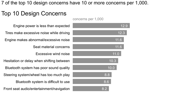
Let's look at a simple example applying these lessons (if you're a regular reader, you may recognize this example, as I've used it before). Imagine you work for a car manufacturer. You're interested in sharing insight around the top design concerns for a particular make and model. Your initial visual might look something like the following:


While the preceding view may work as part of your exploratory analysis (where you're looking at the data to understand what might be interesting or noteworthy), it can be improved when it comes to explanatory analysis (where you want to communicate those interesting or noteworthy observations to someone else) by applying the lessons we've discussed.

First, let's think about what story we want to tell and make that clear with words:


In the above, we've made clear the point we want to make via the statement above the graph. However, our audience has to do some work to see the evidence of those words in the data. Let's reduce that work by employing some visual cues to help direct their attention:


In the above iteration, it's clear where our audience is meant to look through strategic use of color. We can even take this a step further, continuing the narration and use of color to tell a story with the data we are showing:


In this example, annotation and strategic use of color are combined to turn a simple graph into something more. Lead with story: don't make your audience wait for it or work for it.

Here is the above sequence published on Tableau Public.

Leverage these lessons and Tableau's Story Points feature to turn your data visualizations into compelling stories!

Wednesday, June 18, 2014

leveraging animation: what you present vs. what you circulate

A common challenge in storytelling with data is the following conundrum. When presenting content live, you want to be able to walk your audience through the story, focusing on just the relevant part of the visual. However, the version that gets circulated to your audience - as pre-read or takeaway, or for those who weren't able to attend the meeting - needs to be able to stand on its own without you, the presenter, there to walk the audience through it. Too often, we use the exact same content and visuals for both purposes. This typically renders the content too detailed for the live presentation (particularly if it's being projected on the big screen) and sometimes not detailed enough for the circulated content.

I often tackle this topic in my workshops and have written about it here a couple of times before (look for any posts including the word "slideument," for example this one). In the following post, we'll look at a strategy for leveraging animation coupled with an annotated line graph to meet both of these needs.

Let's assume that you work for a company that makes online social games. You are interested in telling the story around how active users for a given game, let's call it Moonville, have grown over time.

You could use the following visual to talk about growth since the launch of the game in late 2012.


But in doing so, you run the risk of your audience focusing elsewhere in the data while you're talking. Perhaps you want to tell the story chronologically, but your audience may jump immediately to the sharp increase in 2014 and be thinking about what drove that. When they do so, they aren't paying attention to what you're saying.

Alternatively, you can leverage animation to walk your audience through your visual as you tell the corresponding points of the story. For example, I may start with a blank graph (which forces the audience to look at the axis details with you, vs. jump to the data; it can also help build anticipation that will help you to retain your audience's attention). Then I can subsequently show or highlight only the data that is relevant to the specific point I am making, forcing my audience's attention to be exactly where I want it to be as I am talking.

I might say - and show - the following progression:

Today, I'm going to talk you through a success story: the increase in Moonville users over time. First, let me set up what we're looking at. On the vertical y-axis of this graph, we're going to plot active users. This is defined as the number of unique users in the past 30 days. We'll look at how this has changed over time, from the launch in late 2012 to current, shown along the horizontal x-axis.


We launched Moonville in September 2012. By the end of that first month, we had just over 5,000 active users, denoted by the big blue dot at the bottom left of the graph.


Early feedback on the game was mixed. In spite of this - and our early practically complete lack of marketing - the number of active users nearly doubled in the first four months, to almost 11,000 active users by the end of December.


In early 2013, the number of active users increased along a steeper trajectory. This was primarily the result of the friends and family promotions we ran during this time to increase awareness of the game.


Growth was pretty flat over the rest of 2014 as we halted all marketing efforts and focused on quality improvements to the game.


Uptake this year, on the other hand, has been incredible, surpassing our expectations. The revamped and improved game has gone viral. The partnerships we've forged with social media channels have proven successful for continuing to increase our active user base.


At recent growth rates, we anticipate we'll surpass 100,000 active users in June! 

For the more detailed version that you circulate as a follow up or for those who missed your (stellar) presentation, you can leverage a version that annotates the salient points of the story on the line graph directly, as shown below.


This is one strategy for creating a visual (or in this case, set of visuals) that meets both the needs of your live presentation and the circulated version. Note that with this approach, it's imperative that you know your story well to be able to narrate without relying on your visuals (something you should always aim for regardless).

If you're leveraging presentation software, you can set up all of the above on a single slide and leverage animation for the live presentation (with the final annotated line graph positioned on top so it's all that shows on the printed version of the slide). If you do this, you can use the exact same deck for the presentation and the communication that you circulate. Alternatively, you can put each graph on a separate slide and flip through them; in this case, you'd only want to circulate the final annotated version.

If you're interested, the Excel file with the above visuals can be downloaded here.

Thursday, May 22, 2014

the story you want to tell...and the one your data shows

I was working on a makeover for a recent workshop when it became apparent that the story being told wasn't quite right, or at least wasn't exactly the story I would tell after looking at the data in a couple of different ways. In the following post, I'll walk you through an anonymized version of the makeovers and my corresponding thought process.

The original visual looked something like the following. It was accompanied by the headline, "Price has declined for all products on the market since the launch of Product C in 2010."


Based on the headline, what we're most interested in looking at here is the trend of cost over time for each product. The variance in colors across the bars distract from this and make the exercise more difficult than need be. Bear with me here, as we're going to go through probably more iterations of looking at this data than you might typically, but I think the progression is interesting.

For a first look, let's remove the visual obstacle of the variance in color and see what the resulting graph looks like (at the same time taking other steps to make sure things are appropriately labeled and de-clutter by removing unnecessary gridlines, tick marks, etc.):


Going back to the original headline, we're primarily interested in what has happened since Product C was launched in 2010, so let's emphasize the relevant pieces, forcing our attention there, and see what that reveals:


Upon studying this for a moment, we see clear declines in the average retail price for Product A and Product B in the time period of interest, but this doesn't appear to hold true for the products that were launched later. Plus, you've probably been thinking as you've scrolled through these bar chart iterations that we are looking at time, so perhaps a line graph would make more sense. Let's see what that looks like in the same layout as above:


If it wasn't already apparent, it probably now is with the above that it likely makes sense to graph all of the lines against the same x-axis so that we can more easily compare them to each other. This also reduces the clutter and redundancy of all of those year labels. The resulting graph might look like this:


With this view, we can much more easily see and comment on what's happening over time. Again, going back to that initial headline, I might modify it to say something like, "After the launch of Product C in 2010, the average retail price of existing products declined."


But this view also allows us to see something perhaps more interesting and noteworthy: "With the launch of a new product in this space, it is typical to see an initial average retail price increase, followed by a decline."


And perhaps we'd also want to note, "As of 2014, retail prices have converged across products, with an average retail price of $223, ranging from a low of $180 (Product C) to a high of $260 (Product A)."


Note how, with each different view of the data, you were able to more or less clearly see certain things. You can use the strategy above to highlight and tell different pieces of a nuanced story. Just make sure that the story you are telling is the same one that your data shows!

If you're interested, you can download the Excel file with the above visuals here.

Wednesday, January 15, 2014

multifaceted data and story

Registration for the upcoming workshop in Seattle is now open! Details and registration for that, plus upcoming sessions in Boston, DC, and San Francisco can be found here.

Last weekend, I ran workshops for two kdmcBerkeley 1-day sessions on Data Storytelling: Tools and Techniques for professionals working in the public health domain in California. To illustrate the concepts we covered, I used an example based on data from kidsdata.org that showed the percent of 7th graders meeting state fitness standards by race over time.

This is a rich dataset in terms of the number of facets one could focus on and the number of stories one could use it to illustrate. We looked at a number of different potential stories, and how you can change how the audience views the data and what they pay attention to through what you emphasize (and deemphasize). I thought these techniques might be of general interest, so will share them with you here. (The full Excel workbook is downloadable via the link at the end of this post.)

Here is what the data looks like:


As a first step, if we simply plot the above data as a line chart in Excel, we get the following:


I've said this before: the "insert chart" step in your graphing application should be the very first step in your data visualization process (not your last!). We focused on the above in a discussion on clutter: identifying elements that aren't adding informative value and getting rid of them. In this case, we can do things like: eliminate chart border, gridlines, and series markers, drop the trailing zero from the y-axis labels, and reduce the number of x-axis labels so the text will fit horizontally. We also decided the Multiracial line was more distracting than informative, with only 2 data points, and that it wasn't critical to the story we wanted to tell, so we removed it. We reduced the work of going back and forth between the legend at the right and the data it describes by labeling the data series directly. We removed Excel's random color choices (another Cole adage: never let your graphing application choose your colors for you!). After all of that, you end up with something like this:


The next step is to figure out where we want to draw our audience's attention. As I mentioned, there are a lot of different things we could focus on and stories we could tell with this data. Let's look at a few.

We could draw attention to the Pacific Islander group. If we look at 2012 vs. 2002, there hasn't been much change. In the early 2000's, there was some improvement, but then this fell. As of 2012, Pacific Island 7th graders in California have fitness levels lower than every other race:


Or, we could focus on the gap: American Indian, African American, Hispanic/Latino, and Pacific Island 7th graders in the state of California have markedly lower fitness levels in 2012 than their Asian American, White, and Filipino classmates:


We could draw emphasis to the change over the past decade: from our beginning point in 2002 to the latest data in 2012. We see a general up-to-the-right trend. Which is a good thing. Right?


Except that, if we focus in on the past two years (since 2010), we see a declining fitness trend across every race:


If we step back and think about context: these numbers are all low! In fact, across the board, less than 50% of California 7th graders are meeting fitness standards:


And 50% is not the maximum. If we actually think about (and show) the opportunity of where the numbers could be, we see something like the following.


This isn't to say any of the above specific emphasis or stories are right or wrong or better or worse. It depends on context: who are you communicating to and what do you need them to know or do? Use the answers to these questions to determine what data to show and how to show it (without misleading). Note also how, when we emphasize one story, it actually makes it harder to see the others. This is something to be careful of, especially when you're in the exploratory analysis phase - you don't want this to lead you to inadvertently miss something important.

In this particular case, we talked about a (contrived) situation where we were working for a California non-profit on a new marketing campaign aimed at parents to encourage them to promote more physical activity for their children. We assumed also that the 7th grade data broken down by race the best data that we had available, recognizing that the ideal dataset doesn't always exist, or isn't always accessible, so trying to work with what we had. 

Here's what the final version looked like:


If you're interested, the Excel file containing all of the above visuals (as well as the step-by-step decluttering that I summarized above) can be downloaded here.

Monday, November 18, 2013

slopegraph template

I've found myself increasingly using slopegraphs as of late. They can be useful when you have two time periods of data and want to quickly see increases/decreases between the two periods (example below; see second half of this post for more discussion and another example).
From a formatting standpoint, however, they are annoying. They take a lot of time to set up because basically everything is different from graphing application defaults. I realized as I was making a recent one that I make the exact same changes every single time and may actually leverage a template for this (I say "may actually" because I thought that would be the case once before, but it didn't happen, though I've heard from others that they do use it).

In case you find yourself wanting to use a slopegraph (or quickly see whether one will work given the specifics of your data), you can download the Excel template I created here (screenshot below).


Thursday, July 18, 2013

"animation" with power point

Let me begin this post by stating clearly that the only types of animation in Power Point (or substitute your presentation application of choice) that I endorse are: appear, disappear, and (sparingly) transparency. Please steer clear of any bouncing, flying, or fading in/out (as well as any other "slick" animations by which you may be tempted). To use an analogy, flashy animation is to presentation software as 3D is to a graph: unnecessary at best, and distracting at worst.

But that's slightly off topic. Today, I want to show you how you can use Excel and Power Point together with some simple screencasting with QuickTime Player to simulate a fully animated video.

When I solicited examples for a recent workshop, one participant sent me a graph they had created, along with this explanation:
This graphic summarized the key finding of the LAC (Latin America & Caribbean) middle class flagship we just launched. It is clearly not difficult to understand but my frustration was knowing that it could be more effective as an animated chart that could tell in a few seconds how far LAC has come. I tried to no avail to find someone who could do it for us. At the end, The Economist did what I would have liked to have done for our launch (link). 
Could we have done this ourselves? Or who could have done this for us and for how much? What kind of skills are required?
General consensus when I asked around was that The Economist's version was probably done using D3. I don't have any experience with this, and when I read the first part of the summary on the site ("D3 allows you to bind arbitrary data to a Document Object Model (DOM), and then apply data-driven transformations to the document." ...that's a mouthful!), my inclination to use tools more familiar to my audience was confirmed.

What I'll show you here should probably be considered a brute-force approach. There are certainly more eloquent solutions out there, but in case you aren't familiar with those (or don't have time or interest to learn the tools that would allow for them), this is a workable solution using good old Excel and Power Point, together with QuickTime Player.

My approach was to build the final graph in Excel, and then make a number of copies of it, eliminating some of the data elements from each so that I could focus on one component at a time to tell the story. Then I copied and pasted each of these into Power Point (making sure the visual was in exactly the same place on each slide). I pasted onto separate slides, so you see the progression as you move through them. You could also do this on a single slide with animation in Power Point (appear/disappear), which just takes a little more time and patience to set up. Patience is key throughout this process - it's a little painstaking to set up, but in the end I think achieves the desired result. Finally, after my slides were created, I used QuickTime Player to record my computer screen and voice.

Here's my resulting video:


The Excel file used to create the graphs can be downloaded here.
The Power Point file used to create the video above can be downloaded here.

This was my first time using QuickTime Player to create a screencast. I found it to be pretty straightforward; the instructions I followed can be found here.

Note how you could use this same approach in Power Point to focus your audience's attention in a live presentation as well.

Thursday, June 20, 2013

the slideument

A common question has come up in several of my recent workshops: what should I do when the document I'm creating is meant to be used both as a written report and as part of a live presentation?

In an idea world, this situation would never arise. Rather, you would prepare two distinct deliverables:
  1. A written report, where you can get away with denser content and rely more heavily on things like written words and an appendix to make sure the necessary context and explanation are present for your audience.
  2. A presentation, where slides are much less dense, font is never smaller than 16-point, and the speaker is able to verbally provide the necessary information so it need not all be physically written down.
In reality, this rarely happens. Time and other constraints lead us to create something that is meant to be a sort of mesh of these two things: the slideument.* 
*I can't take credit for this mashup, but rather must give it to Nancy Duarte, who discusses the slideument in her book, slide:ology.

So the question remains: if slideuments are the reality, what should we do? In this post, we'll take a look at some of the challenges this presents as well as some strategies for overcoming them.

The crux of the challenge is: the report needs to be able to stand on its own without a presenter there to explain it. But if you put the dense slide that meets this first need in front of your audience, you lose them immediately because they turn their attention to trying to understand what you've put in front of them and stop listening to you. Or worse yet, they see that what you've put in front of them looks overwhelming, so they tune both it and you out and turn their attention to something else altogether. In either case, you've lost some of your audience and thus your ability to communicate effectively.

One solution I'll propose is to maintain the density of information (to ensure an audience who is consuming this info on their own has the details necessary to do so) and use animation in your presentation software to enable to presenter to focus on just one piece of the visual at a time, while simultaneously ensuring that's where the audience's attention will be focused as well. In this way, we are able to lead our live audience through the pieces and communicate effectively to those digesting the information later with the written report.

Let's look at an example. Imagine that I want to show an overview of my organization's social media followers (assume this is context that sets up the interesting story that we aim to tell in the rest of the presentation/report). Imagine also that I've been given the constraint of a single slide to do this. My slide might look something like this:


While this level of detail might be fine to have on a single page of a report that someone looks at on their computer screen or on a printed page, it can be overwhelming when you put it up on the big screen. There's a lot to take in, so if you show it all at once, some in your audience may tune out entirely, while others will busy themselves reading through what they are looking at (and unfortunately, when they do this it means they've stopped listening to you).

One way we can prevent this is by only showing a single element of the page at a time. Tactically, you can do this either by having elements of the page appear and disappear or covering up elements on the page with white (either solid or semi-transparent) boxes and using animation in your presentation software to only show one item at a time. So perhaps you flash up the full slide as you tell your audience you are going to talk them through what they are looking at, piece by piece. First, focus on the membership trend over time:

When your audience can only see one element on the page, their attention will be on it and on you. After you've talked through the membership trend, you could shift to the next element: who the members are.

At this point, you could even layer on some preattentive attributes, like color, to draw your audience to a specific part of the element and talk about what's interesting there.


(Yes, the font is tiny; if you're there to explain why the blue part is interesting, perhaps the supporting text at the very bottom is best left as part of the report version and never presented). Then you could step through the remaining elements in the same manner, one by one, explaining and pausing to point out the interesting aspects of each.

Sure, it would be better if you could give each of these elements their own slide. But in the scenario where that isn't possible, perhaps you'll find these tricks helpful.

You can download the PowerPoint here. I've included a version where the graphs appear/disappear directly, as well as one that leverages transparent boxes to direct the audience's focus to a single element at a time.

Tuesday, May 14, 2013

plotting a value within a range

I often refer to my method of creating graphs as "brute force Excel," meaning that you can make almost anything work in Excel, but it sometimes means getting a little creative. The method described in this post can be considered a prime example of brute force Excel.

This example was taken from a recent workshop, where I've anonymized the details. The goal was to understand the cost of various high cost items in a given region relative to some comparison regions. The hypothesis was that the region of interest (Region 1, in the example below) had higher cost items than the other regions. The original visual was a table that looked something like this:


The table in this case might be helpful for the exploratory analysis, but it isn't well-suited for explanatory analysis, because there is simply too much to try to take in to form a conclusion. So I knew going in that I wanted to make the data more visual. The question was: how?

While I was considering this, I sketched out an idea:


Rather than show the individual values for each of the regions, my idea was to plot the range of prices across the various regions, from the minimum value to the maximum value (irrespective of which region has the min or max price, since it didn't seem like that was critical for what we are trying to show here) and then show the specific value for Region 1, the region of interest, within that range.

The next challenge was how to create this visual in Excel. I'll take you through how I did this. The brute force in this case is a couple of stacked bar charts, with some of the series made to be invisible. Here's the step-by-step:

STEP 1: Plot the minimum price and range (the difference between the maximum value and the minimum value across the various regions) as a stacked bar chart on the primary axis.

STEP 2: Make the blue series (Min) invisible by formatting it so there is no fill color, no line, and no shadow (I will never understand why Excel adds a shadow in the first place!).

STEP 3: Plot the Region 1 price and Marker (for this, I just put a value of 100 across all of the items - just big enough for it to show up on the graph - this will be what we'll use to show where Region 1 falls within the range) on the secondary axis. At this step, you must set the secondary axis maximum to $16,000 (overwriting the default of $10,000) so that it lines up with the primary x-axis.

STEP 4: Add data labels to the green series (Region 1) and format them so they are placed at "inside end" of the bar. Then make the green series invisible (no fill, no line, no shadow).

STEP 5: Format, format, format! The base visual looks like what we want. Now it's about playing with the details of the visual so that the information is as straightforward to consume as possible.

In this step, I think about getting rid of clutter, using color strategically to draw my audience's eye to where I want them to pay attention, and adding titles, footnotes, etc. to describe and explain my visual. A couple of notes on changes I made in this step:

  • The item names and horizontal borders are in the cells directly (vs. part of the graph); I find it easier to format the visual this way, you just have to be sure that you've sized the graph so it lines up to the labels. 
  • I reversed the order of the y-axis so the items range from min to max (vs. max to min as shown in the above steps) to leverage how our eyes tend to take in information (from left to right).


The above visual still takes a little processing to figure out what's going on. But I find the data much faster to process here than it was in the original table. Now, we can see relatively quickly that the price in Region 1 is mostly on the lower end of the ranges when compared to other regions (with a couple exceptions).

The final step would be to put the story around this visual: what it shows, why that's interesting, and what action should be taken (hard to do with the generalized example, but there was an interesting story here in the original version).

The Excel workbook with the progression outlined above can be downloaded here.

Thursday, March 14, 2013

strategies for avoiding the spaghetti graph

It seems that I have a distaste for any chart type that has food in its title. My hatred of pie charts is well documented. Donuts are even worse. Here's another to add to the list: the spaghetti graph. Haven't seen one before? Oh, but surely, you have. They look something like this:


They are referred to as the spaghetti graph (by me, at least) because they look like someone took a handful of uncooked spaghetti noodles and threw them on the ground. And they are about as informative as such an action would be...

...which is to say

not at all.

There are a few strategies for taking the would-be-spaghetti graph and creating more visual sense of the data. Two such strategies that I've employed (there are certainly more) are 1) separating the lines spatially and 2) using preattentive attributes to emphasize one line at a time, while still leaving the others there for comparison. A third strategy could be a combination of these first two. I'll discuss these three approaches and show you some examples in the following. Caveat: the second and third approach I'll cover do have some redundancy of information, but it's not clear to me that's necessarily a bad thing (though if this bothers you a great deal, you may want to stop reading here).

Let's look at an example of each of these approaches.

Separating spatially
We can pull the lines apart vertically and give each its own graph (but mash the graphs together so they still appear to be a single visual):


It's important in the above example that my y-axis minimum and maximum are the same for each graph so that the reader can compare the relative position of each line/point within the given area.

Note that this approach assumes that being able to see the trend for a given category is more important than comparing it to the other categories - you can still do this latter comparison, but it isn't as easy visually because of the way the lines have been separated.

Emphasizing one line at a time
Another approach would be to have multiple graphs, where you plot all of the data on each but highlight a single trend at a time. Here's an example (note that this and the following example graph different data than above):


In this case, you can see each trend on it's own, but also have the others there in the background for reference. Here, I've emphasized the 2012 figures by including a marker and the data label and organized the charts from highest to lowest 2012 budget.

Combined approach
A third approach could be a combination of the above two:


Personally, this is my favorite for this particular data (I originally tried approach 1 here, but it was really hard to compare any given trend to the others, which wasn't ideal in this case).

In any event, if you find yourself facing a spaghetti graph, don't stop there. Think about what information you want to most convey, what story you want to tell, and what changes to the visual could help you accomplish that effectively. Perhaps the above examples will give you some ideas. If you're interested in the Excel file with the examples above, you can download it here.

Do you have other strategies for avoiding the spaghetti graph? Feedback on the above? Leave a comment with your thoughts!

8/25/14 update: check out this Washington Post article for a nice example of emphasizing one line at a time (via @jschwabish)

Friday, August 10, 2012

evaluating word clouds

Word clouds created a bit of buzz when they first became popular a couple of years ago (or at least that's when I encountered them for the first time). Like the infographic, they have a bit of sex appeal that draws you in. As in the case of infographics, however, I often find that upon further evaluation they tend to be a letdown - full of fluff without so much informative value.

While facilitating a workshop recently, I heard a horror story about someone who had tried to create a word cloud by hand (perhaps the scariest part of the story involved scaling text boxes one at a time). Lesson: in data viz (and in life), if you find yourself doing something tedious and repetitive like that, stop to reevaluate. At minimum, do a Google search. Even better if you can find a blog post or related article on the topic from someone who has encountered the same challenge before and identified an eloquent solution.

In the case of word clouds, there are a number of applications you can use to generate them. Wordle is a popular free product (created by Jonathan Feinberg of IBM, note that if you upload your Wordle to the gallery, the data goes with it, though you can also opt for local-only word cloud generation) that allows for quite a bit of customization of color, size, font, etc. Google docs has a word cloud gadget within spreadsheets. There are a number of others, easily located via a Google search.

But before you start thinking about generating word clouds, let's continue our discussion on their efficacy. Their sexiness can draw you in. But is there value beyond that? I think it comes down to the use case. I've got one example for the negative and one for the affirmative.

Poor use of word clouds
First, let's take a look at an example from a Community Health Center. My understanding is that they employed a consultant to analyze some survey data from their clients. The consultant put together a report filled with pretty word clouds like this one:


Good service is... minutes? Part of the challenge in this case is that the connotation has been completely stripped away from the nouns, removing the sentiment behind the comments. Which is kind of the important part of the comments, in my opinion. But in reading the report, buried near the end of it, I found the following:

The consultants took the time to content-code the comments. These categories and their descriptions are much more useful for understanding what people value than the word cloud. With this info, we can direct action: we get an understanding of what's going well that we want to maintain, as well as potential areas for improvement. We could take this a step further of making the data visual like this:


In this case, I think the simple bar chart is much more useful (in terms of both understanding the information and determining how to act on it) than the word cloud. Now let's look at a better use of word clouds.

Thoughtful use of word clouds
Caveat: this example came to me by way of the telephone game (I heard it from someone who heard it from someone), which means it's guaranteed that I don't have the details totally right. But I think this still serves well as an example of a good use of word clouds. The story goes: Apple stores obviously really value customer service. They use surveys to collect info about each store. Each day, they create a word cloud for each store based on customer comments. What they are looking for are 5 (I'm making that number up, I don't know what the real number is) specific words - things that are considered must-haves when it comes to customer service in their stores. It's when these [5] words don't show up prominently on the word cloud for a given store that a red flag is raised and some sort of action is taken.

This is what I would consider a thoughtful and actionable use of word clouds. If the required word doesn't appear, some sort of intervention happens.

We can generalize this to the following: when you're considering using a word cloud, think about what you want your audience to know and what you want your audience to do. Then ask yourself if a word cloud will enable them to know and do those things.

And for goodness sake, if you do use a word cloud - leverage some of the tools that exist - don't try to create it by hand!