Showing posts with label Storytelling. Show all posts

Friday, May 29, 2015

dogfood with data

My husband and I were watching TV one evening last week. One commercial caught my attention. It was a commercial for Eukanuba dog food.

I do not have a dog.

Still, there was something about the combination of music and video and text with a bit of data that left an impression. As a side note, I find it very interesting that because dogs have shorter lives, life-long studies are possible in a much shorter timeframe than for humans.

When I was searching for the commercial today (more than a week since seeing it), I did not remember the specific stats. But I did remember the message: their study showed dogs treated well on a diet of Eukanuba live longer.

I often get asked about the inclusion of pictures and videos when it comes to presentations in general. For me, the thing to think about is whether that picture or video will help you make your point and help that point stick with your audience.

Along those lines, I find this commercial to be an excellent example of storytelling with data. Enjoy!

Monday, July 14, 2014

lead with story

July is storytelling month over at the Tableau Public Blog; the following is a guest post I authored.

When asked to write a guest blog post for this month's focus on storytelling, I spent some time reflecting: if I had just a single lesson to share, what's the #1 piece of advice I'd give in this space? I'd boil it down to three simple words: lead with story.

It may sound counterintuitive, but success in data visualization does not start or end with data visualization. To resonate with your audience, you need to do more than simply show data. Attention and time should be paid to the context for the need to communicate: what does your audience need to know? What do they need to do? How can you make the data you want to share meaningful and memorable? Part of the answer is story. Stories resonate and stick with us in ways that data alone cannot. Purposeful story can bridge the gap between showing data and imparting information.

Now, if you're an analyst by training (like me), "leading with story" might strike you as a little off-putting. This can be an uncomfortable space for many. Often, this seems to be driven by the belief that the audience knows better and therefore should choose whether and how to act upon the information presented. In other words, that they should be the ones creating the story. I would argue this is rarely (if ever) the case: if you are the one analyzing and communicating the data, you likely know it best, you are a subject matter expert. This puts you in a unique position to interpret the data and lead people to understanding and action. So, while it may feel more comfortable to lead with the data, I recommend you fight this urge when it comes to explanatory analysis and lead with story.

To ensure you story comes across clearly, there are two lessons to keep in mind: 1) don't make your audience wait for it, and 2) don't make your audience work for it. Let's discuss each in a little more detail and then look at an example of these lessons in action.


Don't make your audience wait for story
Don't bury your story: lead with it! Too often, I see situations where the communicator of the information wants to take the audience through the same chronological path they took to reach their conclusion. In most cases, this is unnecessary. Rather, lead with the "so what" and then back up into the path you took to get there only if absolutely necessary. This way, you don't leave your audience wondering when you're going to get to the point and run the risk of losing their attention before you do.

When it comes to crafting the narrative arc, I recommend storyboarding. Storyboarding is perhaps the single most important thing you can do up front to ensure the communication you're crafting is on point: it establishes a structure for your communication. Write each of the main points you want to make on a post-it note. Then you can play with different arrangements to get the right flow that makes sense given your audience and what you want to communicate. Once you get the flow how you want it using this low-tech method, you can leverage Tableau's Story Points feature to create this same narrative arc with your data visualizations. For more on storyboarding, check out this blog post.


Don't make your audience work for story
Spend time making the story you're telling impossible to miss in your data visualization by leveraging visual cues to help direct your audience where to look. Without these visual cues, our audience has to do work to figure out where they are meant to pay attention. When we ask our audience to do work, we run the risk of them deciding they don't want to and moving on to something else, at which point we've lost our opportunity to communicate. Preattentive attributes like size, color, and placement on page/screen can be used strategically to signal to your audience where to look in the visual for evidence of the story you are telling. For more on preattentive attributes, check out this blog post.


Lessons in action
Let's look at a simple example applying these lessons (if you're a regular reader, you may recognize this example, as I've used it before). Imagine you work for a car manufacturer. You're interested in sharing insight around the top design concerns for a particular make and model. Your initial visual might look something like the following:


While the preceding view may work as part of your exploratory analysis (where you're looking at the data to understand what might be interesting or noteworthy), it can be improved when it comes to explanatory analysis (where you want to communicate those interesting or noteworthy observations to someone else) by applying the lessons we've discussed.

First, let's think about what story we want to tell and make that clear with words:
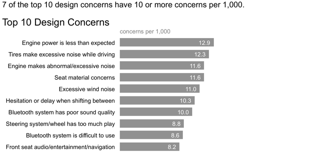


In the above, we've made clear the point we want to make via the statement above the graph. However, our audience has to do some work to see the evidence of those words in the data. Let's reduce that work by employing some visual cues to help direct their attention:


In the above iteration, it's clear where our audience is meant to look through strategic use of color. We can even take this a step further, continuing the narration and use of color to tell a story with the data we are showing:


In this example, annotation and strategic use of color are combined to turn a simple graph into something more. Lead with story: don't make your audience wait for it or work for it.

Here is the above sequence published on Tableau Public.

Leverage these lessons and Tableau's Story Points feature to turn your data visualizations into compelling stories!

Monday, February 10, 2014

storyboarding

In this series of posts, the focus is on concepts you can leverage at the onset of the communication process (when you know what you want to communicate, but before you've actually started crafting the communication itself). Previously, we've covered the 3-minute story and the Big Idea.

Today, we'll focus on storyboarding.

Storyboarding is perhaps the single most important thing you can do up front to ensure the communication you're crafting is on point. The storyboard establishes a structure for your communication. It's basically an outline. It can be subject to change as you work through the details, but establishing a structure at the onset will set you up for success. When you can (and as makes sense), get buy-in from your client or stakeholder at this step. It will help ensure what you're planning is in line with the need and reduce downstream iterations.

My #1 tip for storyboarding is: don't start with your presentation software. It's too easy to go into slide-creating-mode without thinking about how the pieces fit together and end up with a massive deck that says nothing effectively. I highly recommend going low tech here: leverage a whiteboard, post-it notes, or plain old paper. Personally, I like using post-it notes when I storyboard, because you can rearrange (and add and remove) the pieces easily and explore different narrative flows.

In prior posts, I've used the example of the summer learning program on science. If we're storyboarding this communication, it might look something like the following:


Note that in this case, the Big Idea is at the end. Perhaps we'd want to consider leading with that to ensure our audience doesn't miss the main point, and to help set up why we're communicating to them and why they should care in the first place.


In my opinion, the communication process (whether you're communicating with data or otherwise) shouldn't start with the creation of the communication. Rather, it should start with reflection on the context. Who are you communicating to? What do you need them to know or do? Once you've answered those questions, leverage the 3-minute story, Big Idea, and storyboarding to set yourself up for success when crafting your communication and delivering your message.

Thursday, February 6, 2014

what's the Big Idea?

In my last post, I discussed the 3-minute story and the importance of being able to concisely describe what it is you want to communicate (without reliance on your data and/or visuals). Today, we'll cover an even higher level aggregation: the Big Idea.

The Big Idea boils down the "so-what" of your overall communication even further: to a single sentence. This is a concept that Nancy Duarte discusses in her book, Resonate.* She says the Big Idea has three components:
  1. It must articulate your unique point of view;
  2. It must convey what's at stake; and
  3. It must be a complete sentence.
*A free multimedia version of Resonate is available on Duarte's website here.

In my prior post, I shared the example of a summer learning program on science and what the 3-minute story could sound like. If we condense that even further to the Big Idea, it might be:

The pilot summer learning program aimed at improving students' perception of science was successful and, because of the success, we recommend continuing to offer it going forward; please approve our budget for this program.

Bam. It's clear to your audience what they need to know and what you are asking of them. Some people think being verbose helps convince an audience of your knowledge on a subject, but this often has the opposite effect. It's difficult to be concise, but when you master it, it can work as evidence to your audience that you really know what you're talking about, because you know what's not essential and can boil your message down to its core.

In my experience, the entire resulting communication is better when the person delivering it has taken the time to be really clear on and made sure they can articulate the Big Idea. Note that if your communication medium is slides, each slide should have a clear Big Idea. Then there should also be an overarching Big Idea for the overall communication.

Stay tuned for the next post in this series on storyboarding.

Tuesday, February 4, 2014

the 3-minute story

Just two spots remain in next week's Boston storytelling with data workshop. Details and registration for this and upcoming sessions in Seattle & San Francisco can be found here.

In my workshops, the very first lesson we typically cover is on the importance of context. When you have some information you want to communicate, there are a few things that it's helpful to think about before you begin the data visualization process.

As part of this lesson, we discuss three concepts that I recommend employing for success when it comes to creating a communication - note that these apply equally well whether you're communicating data or communicating in general -
  1. the 3-minute story;
  2. the Big Idea; and
  3. storyboarding.
I'll cover each of these in a little detail in this and upcoming posts. 

the 3-minute story
 The 3-minute story is exactly what it sounds like: If you had only three minutes to tell your audience what they need to know: what would that sound like? This is a great way to ensure you are clear on and can articulate the story you want to tell. Being able to do this removes you from dependence on your slides or visuals for a presentation. This can be useful in the situation where your boss unexpectedly asks you what you're working on, or if you find yourself in an elevator with one of your stakeholders and want to give them the quick rundown or get their feedback. Or in the situation when you are watching your time on the agenda wane as others go over their allotted time...from the initial 30 minutes, to 20, to 10, to 5... If you know exactly what it is you want to communicate, you can make it fit the time slot you're given, even if it isn't the one you planned for.

Let's consider an example 3-minute story. Imagine that I am a 4th grade teacher:

A group of us in the science department were brainstorming last year - it seems by the time kids get to their first science class in the 4th grade, they come in with this attitude that it's going to be difficult and they aren't going to like it. It takes a good amount of time at the beginning of the school year to get beyond that. So we thought, what if we try to give kids exposure to science sooner? Can we influence their perception? We piloted a summer learning program last summer that was aimed at doing just that. We invited elementary school students and ended up with a group of about 30 2nd- and 3rd-graders. Our goal was to give them exposure to science in hopes of creating positive perception. To test whether we were successful, we surveyed students before and after the program. We found that, going into the program, the biggest portion of students (40%) felt just "ok" about science, whereas after the program, most of these shifted into positive perceptions, with nearly 70% of total students expressing some level of interest towards science. We feel this demonstrates early success of the program and that we should not only continue to offer it, but also expand our reach with it going forward.

Stay tuned for my next post, where we'll discuss how to boil this down further into the Big Idea.